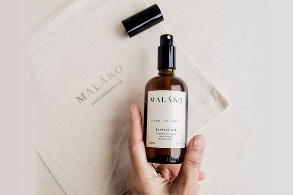
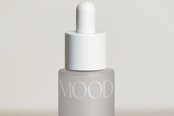
When it comes to starting a business, there are a lot of stressful hurdles. But, one of the more fun hurdles to jump is your brand identity and logo design!
Logos have been a factor of business life before we were born – and it’s safe to say it’s sticking that way. But, when it comes to your skincare logo design – or in fact any business logo design – there are few important things to remember.
With that said, take 5 minutes out to read through our 3 essential tips to ensure your logo design gets noticed and stands the test of time.

Avoid The Trends
First things first, let’s talk about trends. In this modern age, trends come and go quicker than a blink of an eye. Social media has played a huge part in that. Some stick around for a while, but the majority just remain periodic fads.
While it’s essential to have your branding resonate with your audience and look contemporary, you should not make the current trend your main focus. Why? Well, like we said, trends come and go. We don’t want your logo to do that.
Save the trends for your marketing strategy. This is where it will get best results.

Less is always more
We understand that you can sometimes want to cram a lot of information into your logo, but, at best your logo will simply be glanced at. This isn’t a bad thing. In fact it’s a good thing! The quicker people can associate your logo with your brand the better.
Complexity is what needs to be avoided and for that, you have to depend on the concept of minimalism. Remove the clutter and bring simplicity to the design.
Use a minimal color palette and select shapes, icons, font styles and symbols that do not make your visual message too confusing to comprehend. Understand that less is more. The more elements you add to your logo design, the more complex it becomes.
Give your logo a test drive
Once you have your logo design, it’s time to test it out! It’s more than likely your logo is going to feature on a number of different elements – both digital and physical. Logos can change between the two. A logo on a business card or a store sign would look different from the one on a website.
The reason? It all comes down to CMYK and RBG. No, these aren’t new savvy skincare ingredients, they are the color codes for online and offline design.
With both showing different colors, you need to ensure they look good on both. Also take in mind things like your social media profile image. Here you want to avoid textual based logos and have an icon. It’s much easier on the eye.
Remember, you can always go back to the drawing board. Don’t rush your design to get it out there. We know how exciting it is, but patience is key!
Book a consultation with us today!


